Jonny, I know you said we'd have the prev-viz a few days ago what exactly is happening with that and what was the problem holding you up?
Jono, a little earlier you said you'd be putting your files into the dropbox, is there something wrong?
If either of you can put any of your scenes (Jonny) / finished objects for the scenes (Jono) into the dropbox sunday I can start animating.
Need it as soon as possible

Showing posts with label Jonathan. Show all posts
Showing posts with label Jonathan. Show all posts
Saturday, 14 January 2012

Tuesday, 3 January 2012
Texturing Review
Jonno I saw your last uploaded picture (great stuff by the way) But I have to ask what kind of texturing are you planning to do and will it collide with the characters at present?
Friday, 23 December 2011
Project Review
Hi Guys, lets schedule a project review for after christmas break,
how does the 3rd/4th of January sound?
P.s. Did you have a chance to read my Facebook message about the script?
Any Chance of me getting that before this saturday?
pp.s. Merry Christmas!
how does the 3rd/4th of January sound?
P.s. Did you have a chance to read my Facebook message about the script?
Any Chance of me getting that before this saturday?
pp.s. Merry Christmas!
Tuesday, 1 November 2011
UPDATE - Jono's Daylies 31/10/11 - 01/11/11
This post will contain the combined work of yesterday and today.
At the moment I'm focusing on Dorian's Office, since it's the most personal of the sets. It has to be the most cliche, typifying noir detectives office possible; slit blinds, solid desk, drinks and mess.
Here are a few sources of inspiration:


The style is drawn from Lyn-Dae work, bold lines and forms with finer detail within. Dorian imagines himself as a straight, upright figure of the law, as such his office reflects that, being full of square, straight shapes and lines. However, the concentric shapes and mess show flaws and cracks within this vision.


At the moment I'm focusing on Dorian's Office, since it's the most personal of the sets. It has to be the most cliche, typifying noir detectives office possible; slit blinds, solid desk, drinks and mess.
Here are a few sources of inspiration:
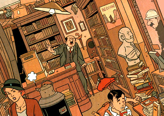


The style is drawn from Lyn-Dae work, bold lines and forms with finer detail within. Dorian imagines himself as a straight, upright figure of the law, as such his office reflects that, being full of square, straight shapes and lines. However, the concentric shapes and mess show flaws and cracks within this vision.


Another view of Dorian's office...

Monday, 31 October 2011
Sunday, 30 October 2011
Daylies - 30/10/11 - Jonathan
Here's my sketches from Sunday. These are more of a creative dump, trying to get cliche and things out of my head. I'm at a thumbnail stage at the moment, but today I plan to try and take these forward into some more detailed sketches.


Following the idea behind the character design, The buildings are defined as basic shapes, with solid, uncomplicated outlines. Within these shapes though, thinner lines begin to pick out detail and form. There's a lot to play with in terms of themes, to reflect the idea of flawed perfection or reality within reality. Since this is a fictional world created by him, it is a cliche, naive creation of a noir world, a ideal one. Detail within detail can represent the idea of worlds within worlds, and the over stylization can point to the ficticious nature of the environment.
Also, Jonny, sorry to sound a bit harsh, but that logo development is hardly 'thorough'... here's the same thing made in 10 mins:

It's some font, with some colour, with a lens flare... A logo needs to be a typifying, solid image that captures our studio.
Subscribe to:
Posts (Atom)